• Please take a moment and update your account profile. If you have an updated account profile with basic information on why you are on Air Warriors it will help other people respond to your posts. How do you update your profile you ask?

    Go here:

    Edit Account Details and Profile

COVID-19

SlickAg

Registered User
pilot
I'm not sure that's a legit graph. I went to the address in the upper left and the CDC isn't currently publishing a graph like that. A quick google shows that the graph seems to be only posted at forums with discussions like this.
I went to the address in the upper left and now have the excel spreadsheet of data from which the graph is generated. If you can tell me how to convert it from a raw spreadsheet into a graphical form we can fact check it. Or I can email it to you? It won't let me attach it here. I was a History major so...excel isn't my strong suit. It's a .csv file and I don't know what that means.

Here's a comparison of Week 11's raw data year over year:
2014 3941
2015 4179
2016 4143
2017 4100
2018 3853
2019 3979
2020 2431

So, 1500 fewer deaths from 2019 to 2020, and that seems roughly on par with the historical average.
 

taxi1

Well-Known Member
pilot
Here’s a graph depicting 2019-2020 pneumonia deaths with the “historical average”. Did they release a new anti-pneumonia drug this year? People must’ve stopped getting pneumonia this winter because the death rate has really dropped off a cliff ever since the Coronavirus came along. Oh wait...

View attachment 25159
I did a google search on the image and got a ton of hits from conspiracy mongers and zero from the CDC. At the CDC there were no charts that look like that. Finally, if those are deaths per week, then it is saying about 180,000 people die from pneumonia each year, which is BS. But..you have the file?

Can you post the CSV link?

Ahh, here


If you look at the data, the “all deaths” column also has a big drop in it. Fewer people dying, or a counting issue? The ratio of pneumonia deaths to all deaths is normal or higher than normal (third column).
 
Last edited:

SlickAg

Registered User
pilot
I did a google search on the image and got a ton of hits from conspiracy mongers and zero from the CDC. At the CDC there were no charts that look like that. Finally, if those are deaths per week, then it is saying about 180,000 people die from pneumonia each year, which is BS. But..you have the file?

Can you post the CSV link?

So I literally typed the second URL (the one on the bottom) into my browser (Safari) and it took me to a page that had a blue question mark box like it was some image that didn’t want to download. But it sent something into my downloads and I clicked on it and excel opened and poof, there was the raw data.

So unless someone has hacked the CDC website that’s where the data came from.

My theory: some excel wizard figured out how to graph the raw data. Hence why the graph isn’t on the CDC website.
 

SlickAg

Registered User
pilot
I did a google search on the image and got a ton of hits from conspiracy mongers and zero from the CDC. At the CDC there were no charts that look like that. Finally, if those are deaths per week, then it is saying about 180,000 people die from pneumonia each year, which is BS. But..you have the file?

Can you post the CSV link?

Ahh, here


If you look at the data, the “all deaths” column also has a big drop in it. Fewer people dying, or a counting issue? The ratio of pneumonia deaths to all deaths is normal or higher than normal (third column).
Upon further googling and a quick experiment, I'm fairly certain some excel wiz was able to use the charts function of excel and graphed the number of pneumonia deaths versus the week.

Whether or not you choose to believe the data or not is fine. But I feel fairly certain this solves the mystery of the missing graph @Pags. And, of course, why it's only showing up when us right-wing conspiracy theorists kooks come out of the woodwork.
 

FinkUFreaky

Well-Known Member
pilot
So I literally typed the second URL (the one on the bottom) into my browser (Safari) and it took me to a page that had a blue question mark box like it was some image that didn’t want to download. But it sent something into my downloads and I clicked on it and excel opened and poof, there was the raw data.

So unless someone has hacked the CDC website that’s where the data came from.

My theory: some excel wizard figured out how to graph the raw data. Hence why the graph isn’t on the CDC website.
CDC probably has good reason not to make a graph of that data. Funding..
 

wink

War Hoover NFO.
None
Super Moderator
Contributor
CDC probably has good reason not to make a graph of that data. Funding..
Incentive, no? It isn't always money, but it tops the list. It is always worth fleshing out the incentives to supporting something as much as to questioning it. Too often it is only one way.
 

SlickAg

Registered User
pilot
An interesting take on COVID from a mathematician. We’ll see if he’s right in about 30 days.


Meanwhile, back at the ranch...seems like people are finally starting to realize that actions have consequences. This should pair nicely with the new unemployment claims data.

Alternate Headline: Panic That Media Was Complicit in Generating Has Negative Consequences (wish I’d come up this on my own)

25178
 

MattWSU

Well-Known Member
pilot
Contributor
Upon further googling and a quick experiment, I'm fairly certain some excel wiz was able to use the charts function of excel and graphed the number of pneumonia deaths versus the week.

Whether or not you choose to believe the data or not is fine. But I feel fairly certain this solves the mystery of the missing graph @Pags. And, of course, why it's only showing up when us right-wing conspiracy theorists kooks come out of the woodwork.

Here’s an explanation: reporting lag. Those weeks will be updated as the year progresses and more reports come in. There will always be the hanging tail you see on the graph but it will continue to slide right.

I did it myself with the raw data (and you can too!). Is that the only way to find truth in the media / blogosphere these days?

Process:
1. Go to https://www.cdc.gov/flu/weekly/weeklyarchives2016-2017/data/nchsdata32.csv
1a. Save the file and open it in excel.

2. Go to https://www.cdc.gov/flu/weekly/weeklyarchives2016-2017/data/nchsdata42.csv
2a. Save the file and open it in excel.

Quck note: the 2016-2017 corresponds to the year and the nchsdata32.csv corresponds to the week. So the first link is the pneumonia record as of Week 32, in 2017. The second link is Week 42 in 2017.

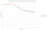
3. Plot a line chart with 'Week of the Year' on the X-axis and 'Death Percetange' on the Y-axis.
3a. Add one series representing CSV from 2017 Week 1-30 as recorded during week 32 of that year.
3b. Add a second series representing CSV from 2017 Week 1-30 as recorded during week 42 of that year.
25179

The delta there, that is indicative of the deaths that will be reported ten weeks later on week 42 that just haven't made it into the system yet. Now just imagine what that delta would look like 52 weeks later, as shown in Slick's original chart.

Almost had me convinced on that one. Now, this doesn’t prove your theory about over-reporting in NYC wrong, just exposes your graph as a piece of manipulative agenda-driven bullshit.

Maybe by the end of this we can get some of you old airline pilots to understand the scientific process. I keed, I keed.

Here's an animation of the above process in-motion that gave me the original inspiration to try it (and make sure it wasn't just liberal agenda-driven bullshit cough).


Hair Warrior

Well-Known Member
Contributor
I am not a big math guy. Only had one basic stats course in college. I have studied economics more than epidemiology or stats. I know human behavior pretty well too. I absolutley guarantee you that the COVID death numbers are inflated. Some by accident I am sure. But there are incentives to record deaths as COVID. So, humans being human, they will respond to incentives. Nothing mysterious or controversial about it.
I think there could be both undercounting and overcounting. It is likely country-dependent (e.g. China undercounting). I also agree that humans respond to incentives, and incentives can skew assumptions and therefore data. But don’t forget that human stupidity can factor into bad data, too.
An interesting take on COVID from a mathematician. We’ll see if he’s right in about 30 days.
I applaud his optimism but I wonder how he could possibly have a large enough sample size to make that claim. Also, in statistics, your model is useless if it violates the rule that data points have to be independent of one another. Obviously, we don’t have that if we look at cities or countries as examples, because people are constantly traveling among them. And I think he may be basing his models too much off of China’s data - China obviously being the first in coronavirus cases, and first to “show recovery.”

China are f#&n liars. I would not trust their official government numbers or recovery claims yet. They have millions of people in undisclosed detention camps. Throughout China’s recent history (post-WW2) the regime has shown a willingness to allow the deaths of millions of their own people if they think it’ll give them the progress they want.
 
Last edited:

Pags

N/A
pilot
Upon further googling and a quick experiment, I'm fairly certain some excel wiz was able to use the charts function of excel and graphed the number of pneumonia deaths versus the week.

Whether or not you choose to believe the data or not is fine. But I feel fairly certain this solves the mystery of the missing graph @Pags. And, of course, why it's only showing up when us right-wing conspiracy theorists kooks come out of the woodwork.
Right on wrt .csv file. I'll have to give it a look. however, as a guy who uses squiggly lines to draw conclusions from I wouldn't draw a conclusion from an incomplete data set. As others have mentioned, it's likely caused by a reporting lag (I don't know their cycle). Would be interesting to recheck in a few weeks.
 

ABMD

Bullets don't fly without Supply
Meanwhile, back at the ranch...seems like people are finally starting to realize that actions have consequences. This should pair nicely with the new unemployment claims data.

Alternate Headline: Panic That Media Was Complicit in Generating Has Negative Consequences (wish I’d come up this on my own)

View attachment 25178
Yup, See my earlier post. Nearly 9% drop in retail sales. Clothing and accessories down >50%. Clothing retailers are really getting pinched. They now have inventory they can't sell (Spring/Summer), and orders for clothes that aren't being filled due to supply chain issues with manufacturing in China.
 
Top